Zone
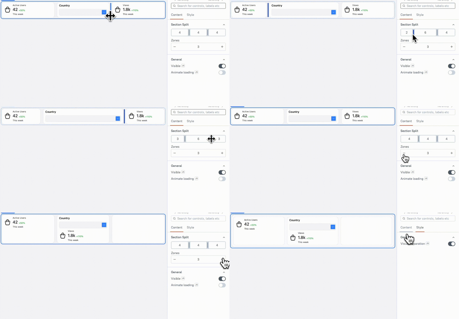
This page provides information on using the Zone Widget, a tool that helps you organize and structure your application layout by creating distinct sections. The Zone Widget uses a 12-column grid system to create responsive layouts. This system divides the layout into 12 equal-width columns, allowing users to structure content in flexible, proportional sections.
This widget is only available in AI Assistant Apps and cannot be used in Classic Apps.

Content properties
These properties are customizable options present in the property pane of the widget, allowing users to modify the widget according to their preferences.
Section Split string
The Section Split property defines how a Zone is divided into multiple horizontal sections, with each section acting as a sub-container. You can split the Zone into a maximum of four sections, each of which can be configured independently.
Each section contains columns that control the space allocation within that section. The number of columns determines the width of widgets placed in the section. Each section must have between 2 and 12 columns, providing flexibility in layout design and allowing precise control over the arrangement of widgets within the Zone.
Example: If you want to create a layout with a small button section and a large Table section, you can divide the Zone into two sections:
- Section 1: 2 columns wide, suitable for small widgets like buttons.
- Section 2: 10 columns wide, ideal for larger widgets like tables or forms.
Zone string
Allows you to define the number of Zones. You can set a minimum of 1 Zone and a maximum of 4 Zones. By default, the section contains 1 Zone.
General
Visible boolean
Controls the visibility of the widget. If you turn off this property, the widget is not visible in View Mode. Additionally, you can use JavaScript by clicking on JS next to the Visible property to control the widget's visibility conditionally.
For example, if you want to make the widget visible only when the user selects "Yes" from a Select widget, you can use the following JavaScript expression:
{{Select1.selectedOptionValue === "Yes"}}
Animate Loading boolean
This property controls whether the widget is displayed with a loading animation. When enabled, the widget shows a skeletal animation during the loading process. Additionally, you can control it through JavaScript by clicking on the JS next to the property.
Style properties
Style properties allow you to change the look and feel of the widget.
General
Visual Separation boolean
Controls the visual distinction of the section by adding an elevated background and/or borders. This property helps to visually separate the section from other sections, making it easier for users to distinguish between different content areas on the page.