Paragraph
This page provides information on using the Paragraph Widget to display and style longer text content such as paragraphs, descriptions, or detailed notes, helping to enhance readability and structure within your application.

Content properties
These properties are customizable options present in the property pane of the widget, allowing users to modify the widget according to their preferences.
General
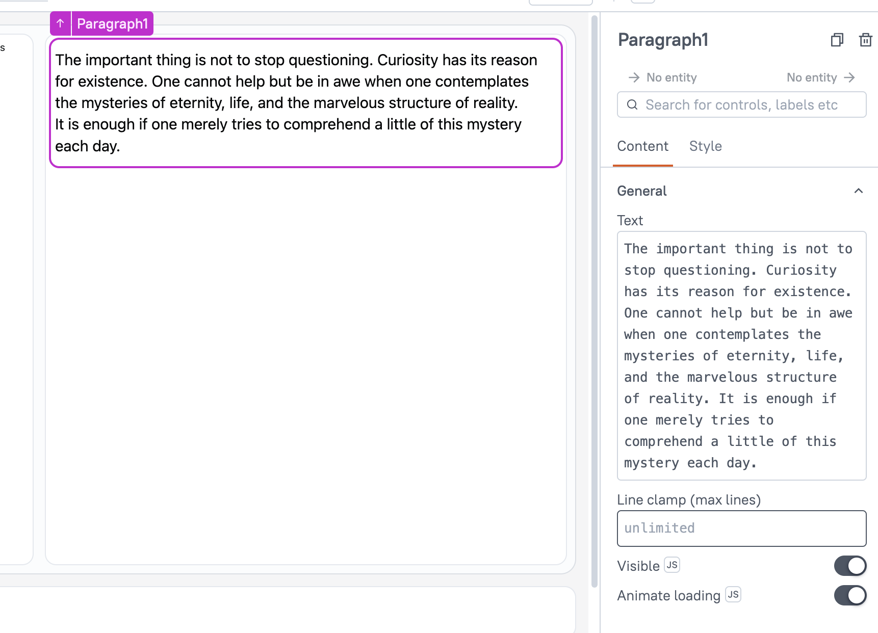
Text string
Sets the text to be displayed. The text remains unchanged until manually updated or edited.
You can dynamically change text by fetching data from queries or JS functions and binding the response to the Text property. For instance, when a row in a Table widget is clicked, the Paragraph widget dynamically displays the specific description associated with that row.
Example:
{{userTable.selectedRow.name}}
Line clamp number
The Line Clamp property specifies the maximum number of lines to display for a text element. Any content exceeding the defined limit is truncated and represented with an ellipsis. When no value is specified, the text automatically adjusts to multiple lines based on its length.
Visible boolean
Controls the visibility of the widget. If you turn off this property, the widget is not visible in View Mode. Additionally, you can use JavaScript by clicking on JS next to the Visible property to control the widget's visibility conditionally.
For example, if you want to make the widget visible only when the user selects "Yes" from a Select widget, you can use the following JavaScript expression:
{{Select1.selectedOptionValue === "Yes"}}
Animate Loading boolean
This property controls whether the widget is displayed with a loading animation. When enabled, the widget shows a skeletal animation during the loading process. Additionally, you can control it through JavaScript by clicking on the JS next to the property.
Style properties
Style properties allow you to change the look and feel of the widget.
General
Font size string
he Font Size property controls the size of the text, with predefined options including Heading, Title, Subtitle, and Body. For the Paragraph Widget, the default font size is set to Body to optimize readability for longer text.
You can enable JS to dynamically set the Font Size, allowing it to change based on specific conditions or user interactions.
Text formatting
Alignment string
Sets the horizontal alignment of the text within the cells.
Options:
- Left
- Center
- Right
Emphasis String
Allows you to choose a font style for the widget, including options like bold or italic. When JS is enabled, you can dynamically modify the font style using JavaScript functions.